context
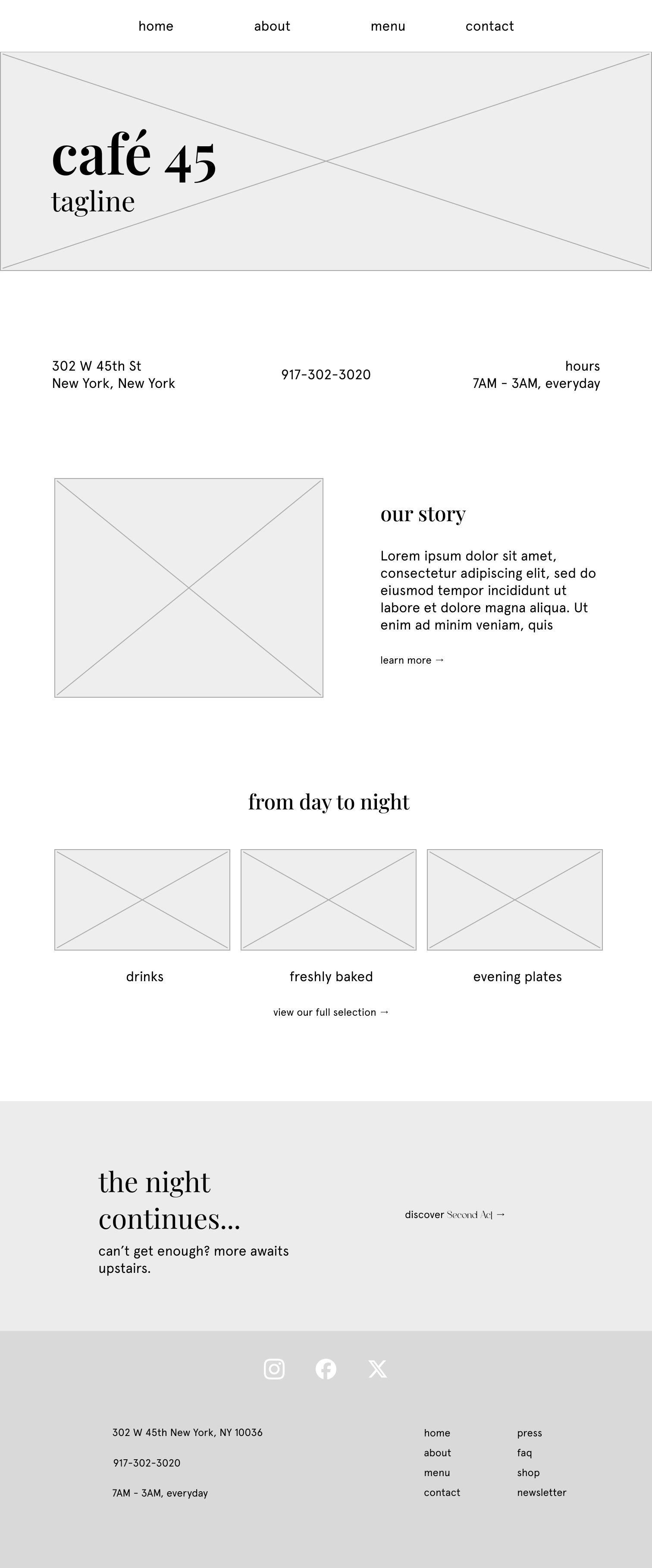
café 45 is a concept rachelle and I developed together — she's a friend and design partner. like all young twenty-somethings, one of our favorite hobbies is searching for new coffee shops and places where we could sit, chat, and talk about work without actually doing any. café 45 is our take on what such a place could look like.
in a city like new york, the lack of "third places" is almost baffling. one would imagine that in a city so dense, we would be teeming with them. but density does not equal access, and the unfortunate truth is that finding space to exist in new york is almost comically difficult. café 45 is designed to be a communal gathering space for one and all, open from the early AM to the later PM for those who are uninterested in how nightlife seems to necessitate alcohol. from weekly events, rotating seasonal drinks, and even a hidden second space upstairs, café 45 invites everyone — whether you love theatre or not — to come share in its comfort.
building the brand
café 45 is meant to be warm and approachable whereas second act is more sophisticated, dramatic. playfair display in all lowercase in addition with the cream, warm brown, and navy accent for café 45 contrasts with the deep crimson and pale gold of second act — properly capitalized in beautiful al bizantheum.
café 45


design process
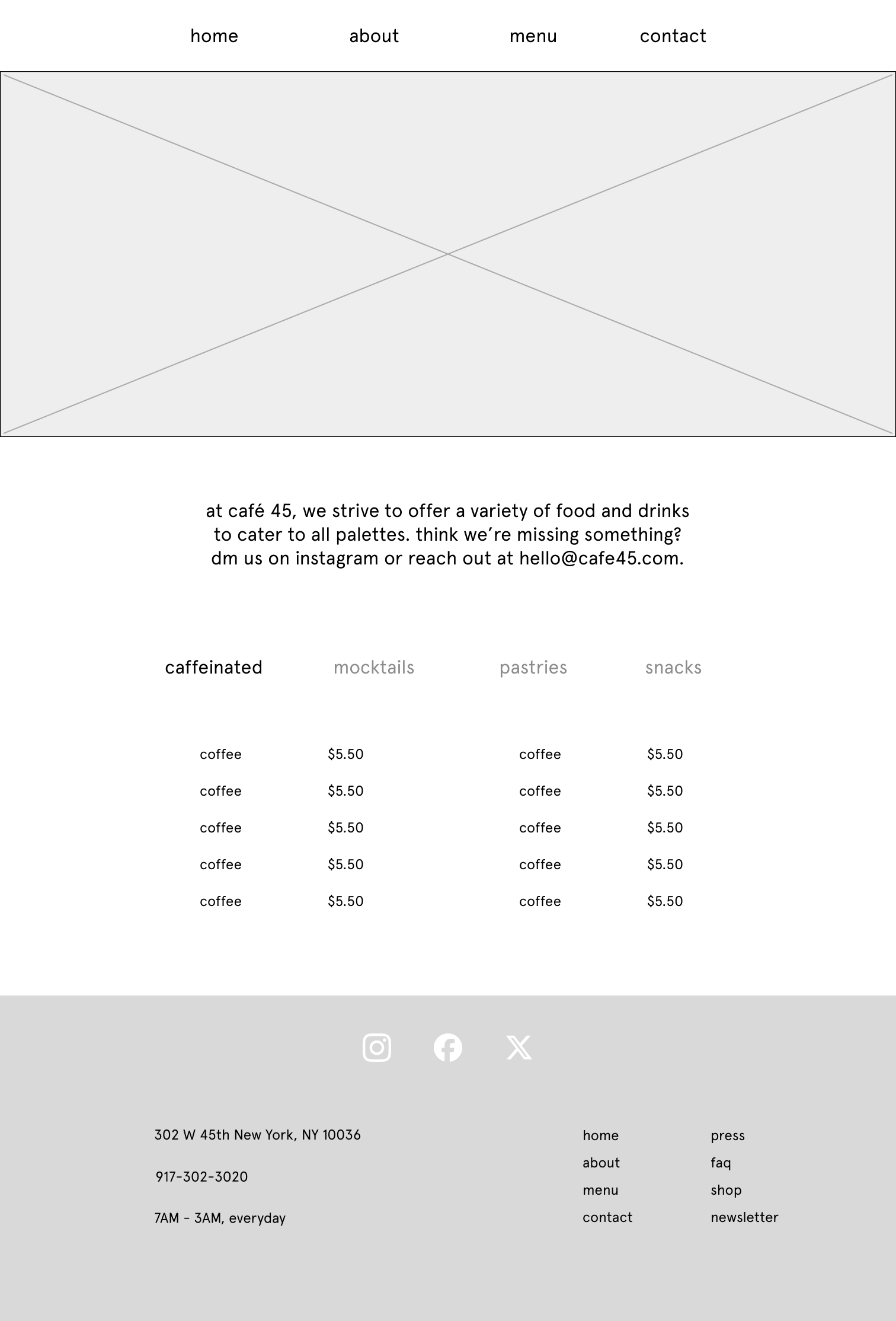
in my research, i found that a lot of café sites were oddly bare. or at least, they merely served up a brief summary of who and what they were, and where you could find them. most did not have any way to order online or glimpse at their menu. this was both understandable and a little annoying as a consumer — the integration of food delivery apps would likely cut into a small business's profits and workflow (anyone who has been to starbucks during rush hour knows the pain), but the inability to navigate a shop's offering is not ideal. of course, most coffee shops merely offer the standard fare, so the menu is not critical — but for café 45, i wanted to have a more standout, substantial menu.
another page that required a bit more attention was the events page. part of what allows café 45 to call itself a third place are the community events it hosts: script readings, audition workshops, even performances by broadway stars. events are, of course, nothing without any attendees, so café 45 needed a clear way to distinguish between its different offerings and a way for patrons to sign up. i experimented with a few different ways to display them — endless scroll, a rolling marquee, calendar navigation — but ultimately ended up sticking to cards for ease of viewing.
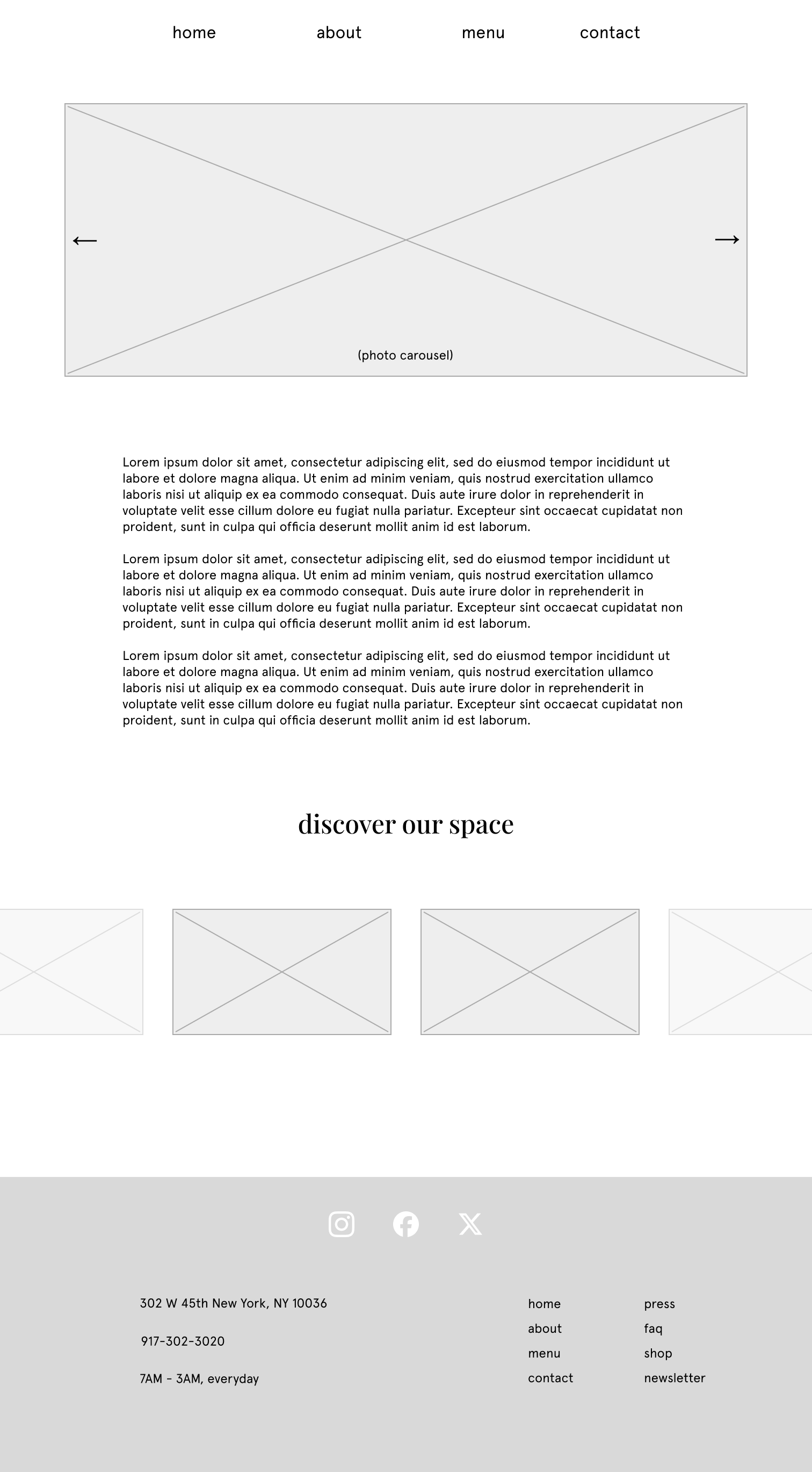
all pages went through substantial iterations as i played with different designs. the home page ended up being the longest as it needed to accomplish the most — a teaser of all the other sections as well as a glimpse into café 45's hidden second floor. the about page ended up being cut entirely; everything that it did could be collapsed into the home page. most users are not so interested in the story as much as what the website can do for them, so adding an entire section dedicated to the purpose of café 45 felt unnecessary.
final design
café 45 came together in an airy, understated sort of way. interactive components include micro-interactions with different hover states in order to help guide the user. the home page contains a teaser of all necessary information — menu sections, glimpses of the space (picture credits to the public hotel on the lower east side, my biggest inspiration of café 45's vibe), and an invitation to visit second act nestled at the bottom.
try it yourself
café 45's website can be experienced here:
reflections
the biggest thing this project taught me was the importance of having a clear design system. relatively speaking café 45's website is not a super dense one, but it still had many reusable bits and pieces that benefitted from utilizing components. in that vein, though, building out my assets page took me the longest as i was designing for every case i could possibly need. in practice, i only used about half. if this were a larger scale project i suspect the others would've come into play, but for a concept project i was designing outside of the necessary scope. if i were doing this again i would be more intentional with the components i build — edge cases are important, but so is prioritizing my time and focus. i am also continuing to learn just how hard it is to make a minimal site seem intentional in its scarcity; lots of thought goes into just how much space is too much!